
Subscription Growth
Provide the user with the information they need to make a purchase decision to help grow Coffee Meets Bagel’s revenue
My Role
Lead Product Designer
Collaborated With
Frontend and Backend eng,
Product manager, UX writer
CX and Data Analytics
Duration
3 weeks
Product Type
Mobile- iOS

What is the problem?
Coffee Meets Bagel’s (CMB) current Subscription Paywall is confusing to daters and it’s causing customers to bounce who would've otherwise made a purchase decision.
How might we help CMB daters make informed purchase decisions so they can confidently transition to being subscribers?
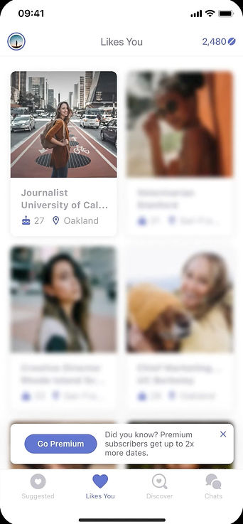
What's the experience to subscribe?

Old paywall design shown above
Current CMB has a freemium business model.
That means all user have limited access to certain features but subscribers have access to richer functionality.
There are multiple places on the app where users may be nudged to subscribe.
Tapping on buttons that unlocks richer functionality, opens the paywall. All eligible users get a 7 day free trial period at the start of a subscription.

Benefits are listed as a carousel and users are not interacting with it
We’re missing out on an opportunity to educate our users about premium
Not Clearly Communicating Benefits or Value of Premium
What's the current experience to subscribe?
Old paywall design shown above
CMB has a freemium business model.
That means all users have limited access to certain features but only subscribers have access to richer functionality.
There are multiple places on the app where users may be nudged to subscribe.
Tapping on buttons that unlock richer functionality, opens the paywall. All eligible users get a 7-day free trial period at the start of a subscription.

Not Clearly Communicating Benefits or Value of Premium
Benefits are listed as a carousel and users are not interacting with it
We’re missing out on an opportunity to educate our users about Premium
Broken UI Pattern
This modal opens over other pop-up modals, bottom sheets, and action sheets. It’s wonky UI.
Misleading Pricing
Pricing is very confusing
Showing percentages requires the user to calculate dollar value
Percentage makes it seems like
it’s discounted at first glance, which
can make the product feel cheapened and degrade user trust
Confusing Call to Action
CTA is deceiving and confusing because it makes the user think they’re starting a free trial but actually they’re also subscribing
Hidden Important Information
All important information about billing and free trial, including legal language, is hidden where no one can notice it
How is the current experience broken?
How did we know it’s a problem?
To understand and validate if our paywall was in fact a problem for our users, we looked at the following sources of data which lead to some insights
1. Behavioral Data from Fullstory
2. Dashboards for Subscriptions
3. CX tickets
4. Qualitative Convos
01
Adoption for free trial was low, even when it was being surfaced in multiple places on the app
02
Subscribers were showing interest by tapping on the ‘Try free trial/ Subscribe” button but they were dropping off on the paywall
03
CX tickets regarding subscriptions were at an all-time high - users did not understand the details of charges being made and asked for refunds
How did we get to the solution?
We took a close look at the current subscription and Free Trial experience. Then we started…

Brainstorming
Coming up with ideas and creating alignment together
Our goal for this brainstorming session was to map out what each of us thought was an essential step to drive users closer to a purchase decision for a service or product
Doing this exercise with key stakeholders helped us create a shared understanding 👇🏽

Mapping the user flow
Outlining the ideal user flow for a non-subscriber to feel confident in moving down the decision funnel
The initial journey we mapped started when the user saw the paywall and ended on the 7th day of the Free Trial. We identified opportunities in the Free Trial period that could compel users to start using Premium, like sending end-of-trial reminders and billing receipts. However, after discussing with key stakeholders, we identified that anything beyond the start of the Free Trial was out of scope for this project because we had to first focus on getting users into the free trial. We were able to surface constraints and priorities and define a more focused solution space using the map below.

Zeroing in on the area of focus
Looking at the old subscription funnel and proposing a new modular solution
The new proposal was to break-up the current paywall into 3 parts, each covering a distinct topic, to help guide users down the purchase decision funnel one step at a time


Value
Plans
Timeline
The Hypothesis
By reducing confusion regarding what is included in subscription plans and how free trial works we’ll help daters make more informed purchase decisions and increase conversion leading to more revenue
Early concepts to final Solutions
Part I : Value
What is CMB Premium?
We further broke this questions down into more parts.
-
What is the value to Premium?
-
How it is better than Basic?
-
What benefits does Premium offer?
Below, you can see the evolutions of how the final benefits screen took shape, using the questions mentioned above as guidelines along with some other constrains.
Version 1.0
Version 1.1
"As a non-subscriber, I want to understand the benefits of CMB Premium so that I can be certain my money is well spent if I choose to subscribe"
Version 1.2

Version 1.4
Version 1.5
Version 1.6

Finalizing Variants and Refining the Visuals for the Benefits Screen
We were interested in running an ABC test targeting revenue with versions 1.5 & 1.6, which we found to be compelling solutions, but first I had to further refine the visual designs. We wanted to make the visuals consistent across the two treatment variants to isolate the impact of the UI/UX changes between them. Versions 1.5 & 1.6 already used largely the same content as each other and control.
We aligned the UI for both variants, this also made work easier for our front end team to build two variants with no additional cost.
Version 1.5 → Variant A
Version 1.6 → Variant B
Provides detailed information about the value benefits offer

Focuses on showcasing the value of Premium compared to Basic
Part II : Timelines
How does free trial work?
The goal here was to set expectations for our user about what to expect during the course of the trial.
We addressed the following questions
-
When does the user have access to Premium?
-
When could the user cancel without being charged for the subscription?
"As a non-subscriber, I want to understand how a Free Trial works so that I won't be charged if I don't find value in the subscription"
Version 1.0
Version 1.1
Version 1.2
Version 1.3

Refining the Visuals for the Free Trial Screen
We found that version 1.3 communicated all of the essential information in the simplest fashion, and was free of redundancies, so we decided to use version 1.3 in the ABC test. But, first we needed to do a final refinement of the visuals, see below.

Version 1.3 → Variant A and B
Part III: Payment Plans
How much does it cost?
Our goal for the payment plan screen was to provide a clear breakdown of cost and showcase the savings from the longer-term plans in an appealing way
"As a non-subscriber who might be interesting in a subscription I want to understand which payment plan has the most value for me"
Version 1.0
Version 1.1
Version 1.2

Finalizing Variants and Refining the Visuals for the Payment Plans Screen
I designed versions 1.1 & 1.2 to allow the user to quickly scan and easily comprehend the differences in duration and price across the plans. I also highlighted the value of choosing a longer plan.
Version 1.1 → Variant A
Version 1.2 → Variant B
Same content as the control. We bundled this with version 1.6 of the benefits screen

Clearly breaks down the cost and provides easier price comparison. We bundled this with version 1.5 of the benefits screen because they're both the more explicit option of their respective pairs
User Testing
Checking for any usability issues or breakdown in communication
After we nailed down the final screens, we tested both Variant A and Variant B with the users. The sample size was 30 users, The goal was not to understand which variant would perform better, which would be assessed in the experiment we were going to run, but to see if users got stuck somewhere. All users were able to complete the task successfully but there were some interesting observations that we gathered.
Test Goal:
Do people understand all the information being presented to them and can they complete the task of signing up for free trial without any issue?


Variant A Video Walkthrough
Variant B Video Walkthrough
On variant B, 40% users were very confused about what these benefits were and hesitated to move forward. They wanted to see more details about the benefits and even tried to tap on them to see more details
Key Observations and
Design Recommendations


Key Observation 01
Variant B: Benefits Screen
Free Trial Timeline Screen
Based on that, I proposed a solution where curious users could expand a Benefit to see more details. This was not implemented in the final build because it would come with significant additional scope and work for frontend engineering
👈 Design Recommendations
There was confusion amongst some users about what day will be ‘Day 7’ on their calendar
Key Observation 02
We didn't wanted our user to do the math and have a frustrating experience in case they calculated the date incorrectly, so we proposed populating the actual date dynamically. This would tell users exactly when their trial is ending. This was not implemented in the final build for the experiment but it is being done as a fast follow
Design Recommendations 👉
Experiment and Results
Drumroll... and the winner is Variant A
The experiment was an ABC test. That means that we tested the performance of the new variants, A and B, against each other but also against the control (the old design). The flow for the new variants is outlined below.

The success metric for this project was rev/user. Variant A and B outperformed the control but
Variant A also outperformed B and increased Rev/User by 6.5%

Variant A : The winning variant
Full Rollout & Future Opportunities
Variant A was rolled out to all iOS users and eventually also to all Android users. By breaking down the Paywall into three clear steps we were able to help users make informed purchase decisions and complete the subscription funnel
The modular structure of this new paywall has enabled the team to optimize the experience by allowing for the measurement of the components individually.
Key takeaway
When it comes to the matter of money, trust is everything to users. Users value transparency above everything else when it comes to spending their money. This solution proved that giving users more autonomy and educating them helps them spend their money with more confidence.
It's as important to mitigate user fears as it is to create delight. So avoiding dark patterns and instead being transparent is key to building user trust.